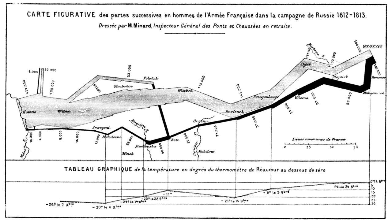
“Probably the best statistical graphic ever drawn, this map by Charles Joseph Minard portrays the losses suffered by Napoleon’s army in the Russian campaign of 1812. Beginning at the Polish-Russian border, the thick band shows the size of the army at each position. The path of Napoleon’s retreat from Moscow in the bitterly cold winter is depicted by the dark lower band, which is tied to temperature and time scales.”
In one graphic, Minard summarized the War of 1812 - Napoleon’s march on Moscow. This 1859 graphic is an illustration of catastrophe.
