maps
/
architecture pictures to follow soon this week, i promise.
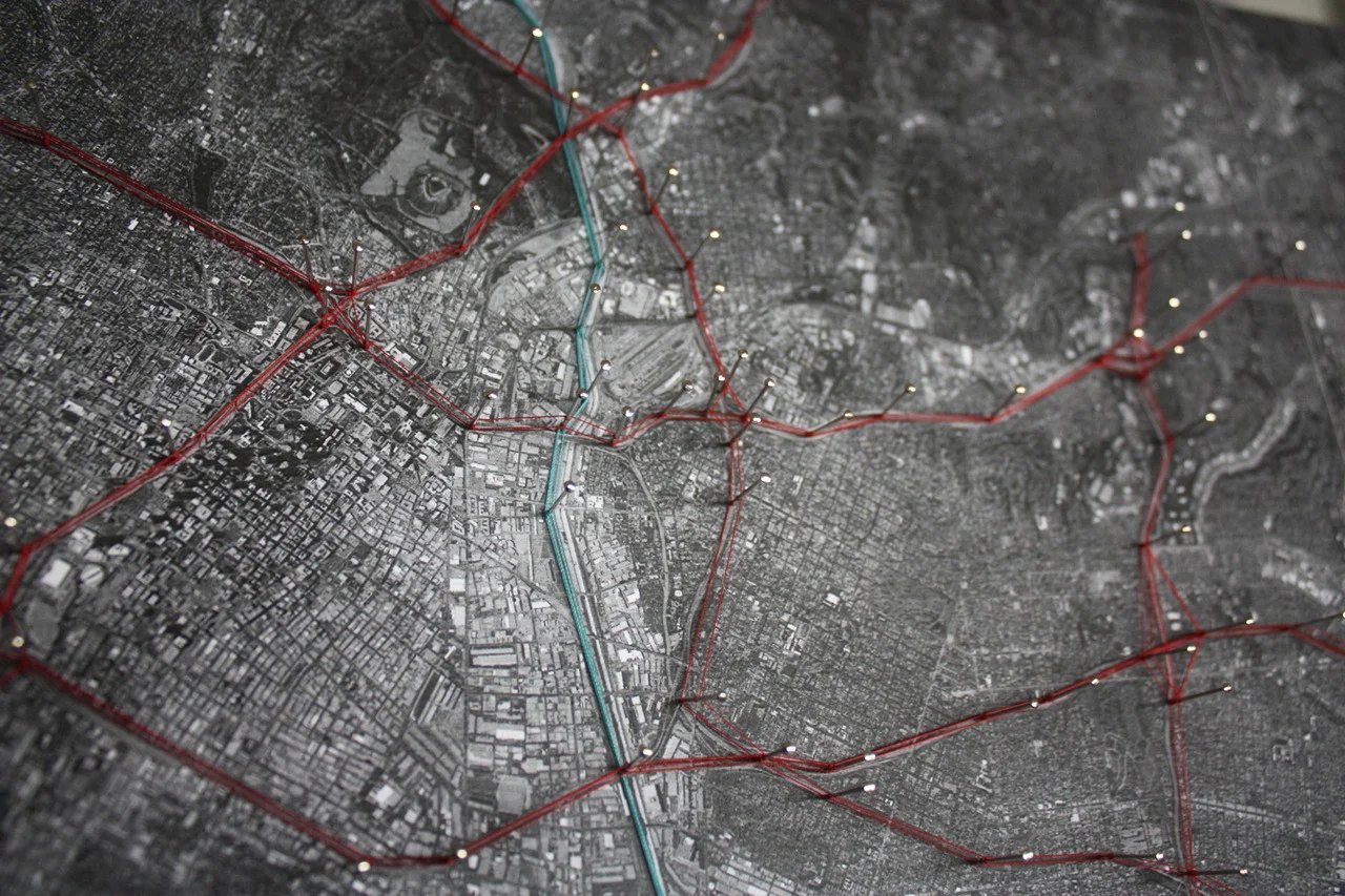
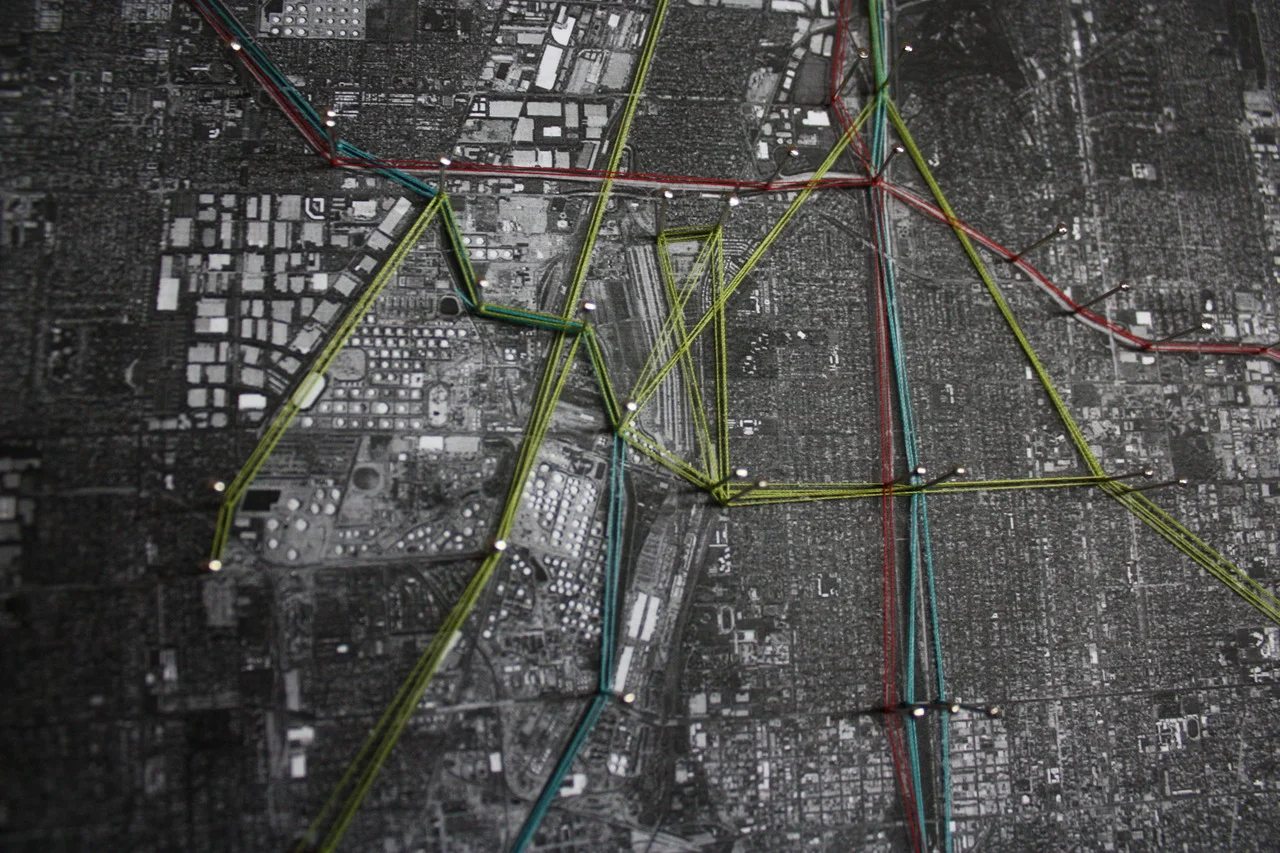
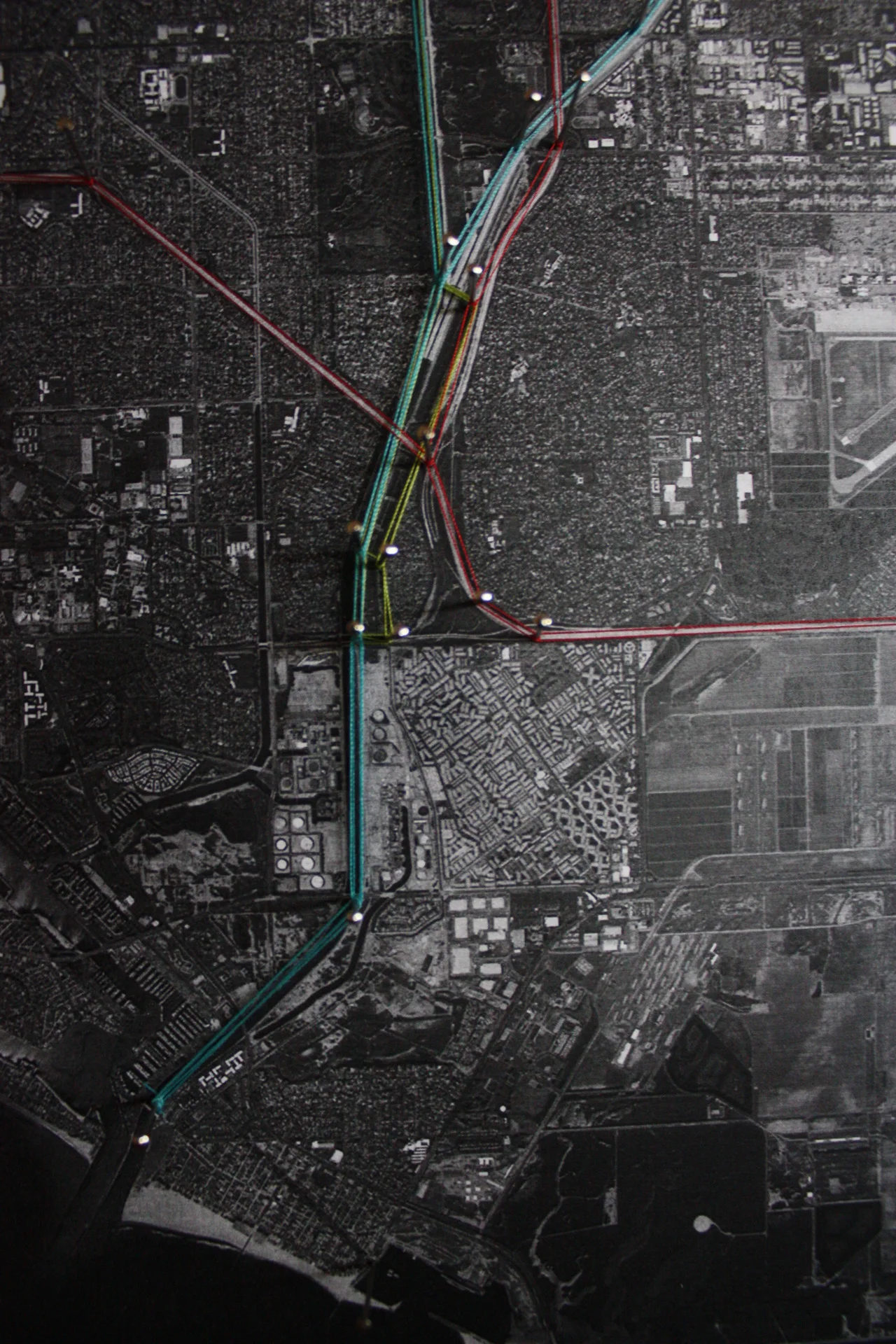
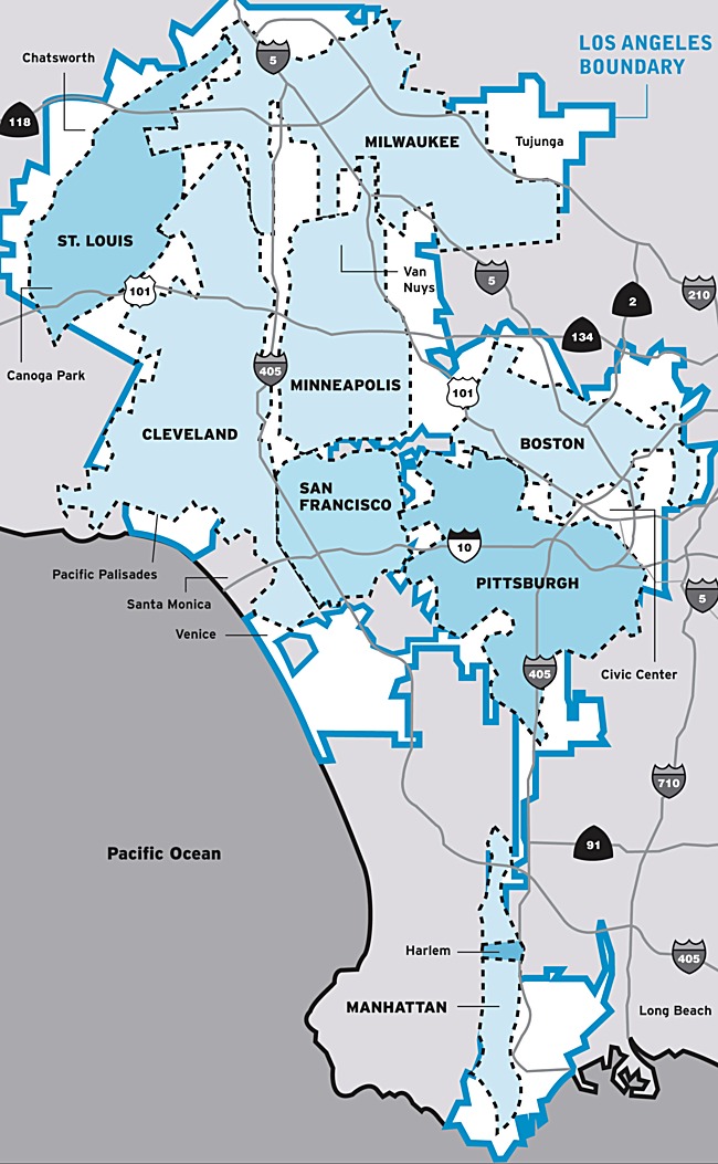
in the meantime, a map of l.a that shows, pretty clearly, the gigantic-ness (which is a real word, according to me) of los angeles.
http://archinect.com/news/article/18228916/comparison-of-other-major-cities-that-can-fit-inside-la
it perhaps helps to understand l.a in terms of it’s sprawl and it’s size. in some ways l.a would make more sense to the world (and, well, to me) if it were considered more of a county, containing about 100 or 200 smaller cities and towns, than a city proper. but as a city proper it’s fascinating and baffling and odd and utopian and dystopian all in equal measure. which is a big part of why i live here.
moby
/
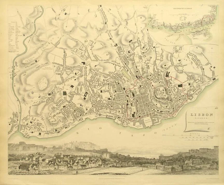
Map of Lisbon in 1833
/
Map of Canberra, 1962
/
Geologic Map of North America [1024x1765]
Digital urbanisms: being urban is being online: Map Kibera: A great example of open mapping creating citizen led social change /
I just discovered the Map Kibera project, the first attempt to map the slums of Kibera using Open Street Maps. OSM trained local teens to become mapmakers back in 2010. Here’s a description of the project from ISP News:
Despite being home to about one million in a densely populated…
notes for James Bridle's open mapping project with balloons /
James Bridle has a great set of notes on a recent balloon mapping workshop that he led in Northern Portugal. He links to his presentation slides and provides a list of items to make your own aerial mapping toolkit. The pictures from the project are so beautiful.
/
The City Lights Globe
This rotating globe illuminates to show how the world’s cities look at night from space. True to the view from orbit, the globe glistens with a soft white glow in major metropolitan areas throughout Eastern Europe and North America and has sparsely lit areas scattered throughout Africa and Russia.
The city lights automatically illuminate in low ambient light and dim when the globe is exposed to light, displaying a multicolor political map with topographical shading and place names for major cities, countries, and bodies of water. The 10” globe rotates automatically on a mirrored base that reflects Antarctica and the surrounding bodies of water.
/
/
wnyc:
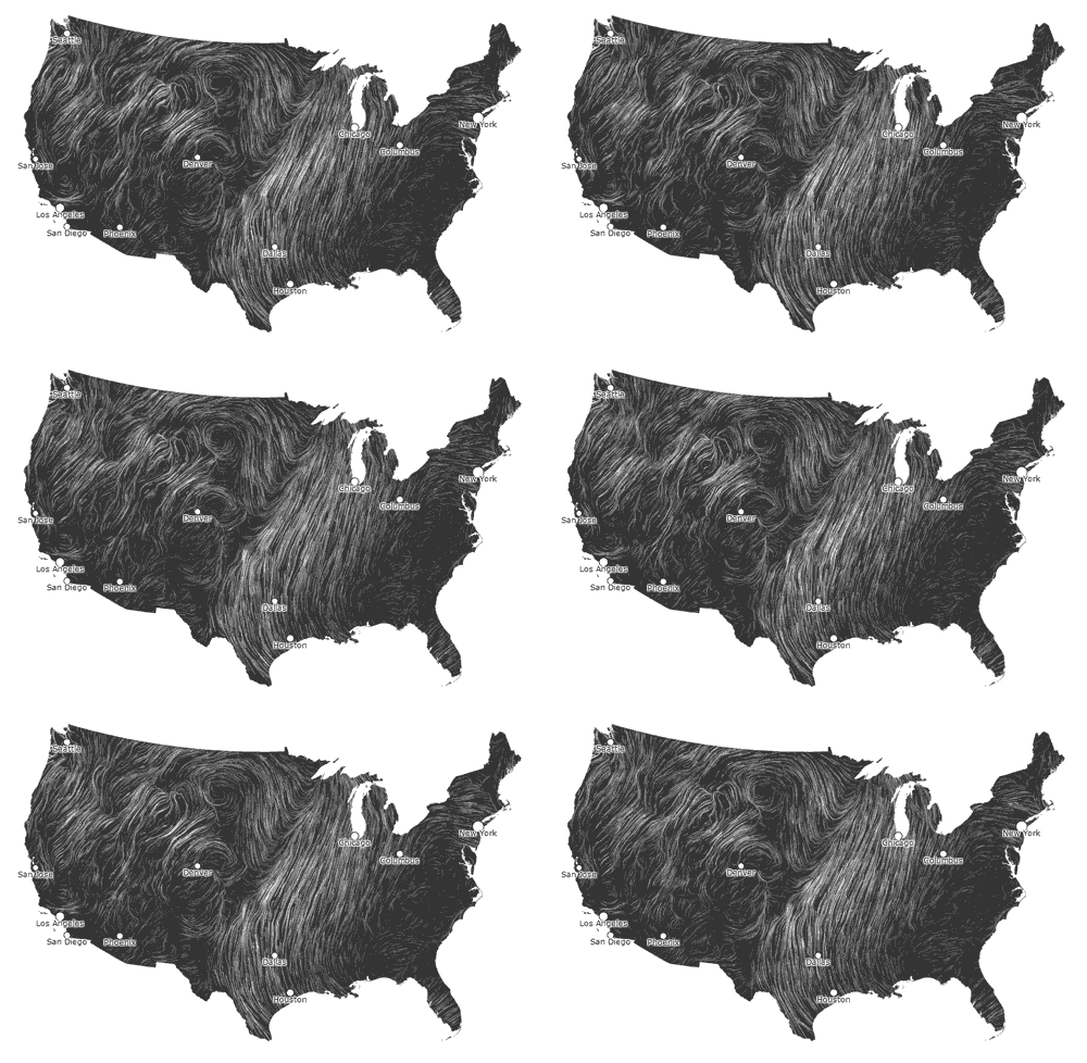
America’s wind flow patterns mapped
Wind is an invisible, ancient source of energy surrounds us—energy that powered the first explorations of the world, and that may be a key to the future.
Chicago: living up to its monicker. —A.P.
/
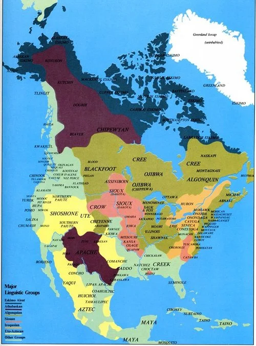
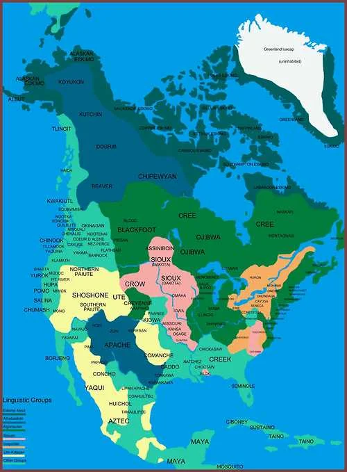
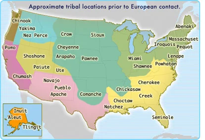
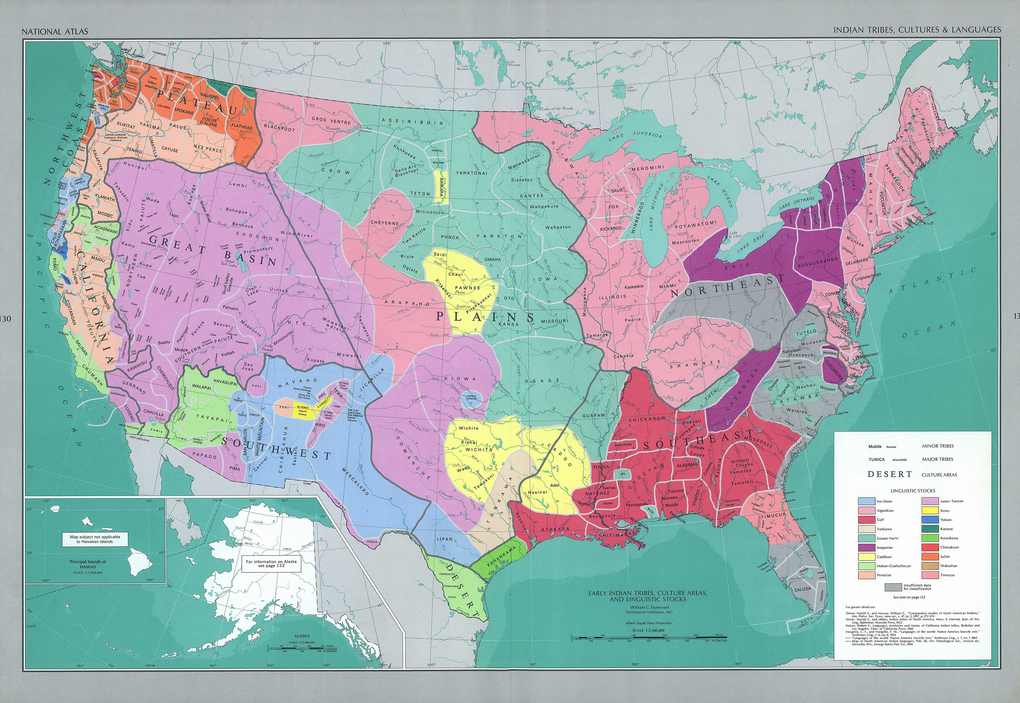
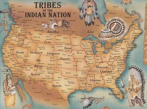
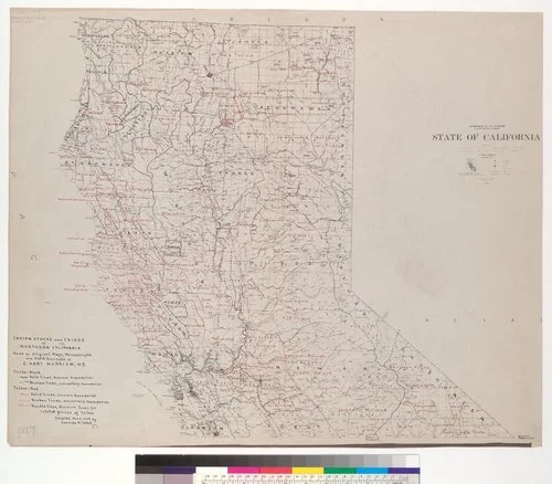
here’s a roundup of the maps of “North American indigenous territories” I’ve seen on tumblr in the last two weeks. please note the following:
- save for the second one, none of them are dated. “pre-contact” is not a date. “colonial” is not a date. the first could mean 1500 or 1850 or anywhere in between. the latter could be any one of those dates, all the way up to the present. an ahistoric map is an uncontextualized map which means it is an essentially useless and ignorant map.
- they all contradict each other. which one is right? they were all drawn by white academics, so it’s hard to really know, huh?
- they all have major flaws and inaccuracies. there are at least 500 different tribes in N. America—none of these maps save the second to last one have that many listed, and that one is of Northern California alone!
Academics and cartographers will lie to you and say that it’s hard to know which lands belonged to whom in the “pre-contact days.” This is a reflection of their unwillingness to dialogue with indigenous peoples and knowledges than it is actual existing information, because you can bet Native peoples know which land is theirs.
They’ll legitimate “estimations” and “generalizations” for the sake of “general knowledge” that “indigenous peoples were there.” That’s part of a larger colonial narrative that tells us it’s okay to belittle indigenous histories and knowledges for the sake of ignorance produced by that same colonial narrative.
Finally, they’ll hide behind industry-granted authority grounded in objectivism—as if colonizers could ever be objective about the lands they’re colonizing. In the words of Fanon, “for the colonized person, objectivity is always turned against them.” This authority is granted by colonial institutions of power that actively works to the detriment of indigenous peoples and legitimates epistemic and material violence from academics and professionals. There is no such thing as objectivity, much less an objective map.
Aside from formal reservation boundaries, there are no maps in existence which adequately represent indigenous territories of North America (and even reservation boundaries are complicated and changing, and don’t include unrecognized tribes). What does indigenous territory mean? Is it legal landholdings? Cultural areas? Linguistic areas? Historic areas, and if so, from which time period? The only way to account for the multiple and varied iterations and meanings of “indigenous territories” is to create maps of extremely small areas, working from indigenous knowledges and histories. They would have to be something like 20x60mi on each page, and even then would require multiple iterations, taking historic change, varying definitions, and varying narratives into account (many boundaries are contested or overlap!). The final project would be a whole series of massive atlases.
Maps are an assertion of power. Think carefully what kind of power you’re perpetuating when using maps like these. For more information and to see other posts I’ve written on the subject (including the use of GIS and linguistic area maps), see these posts: 1, 2, 3, 4, 5, 6, 7, 8, 9, 10, 11.
A reader pointed me to this great post about maps of America.
/
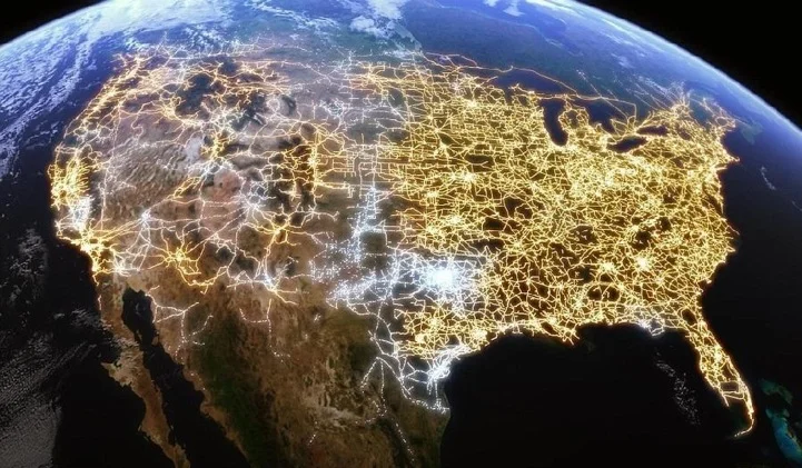
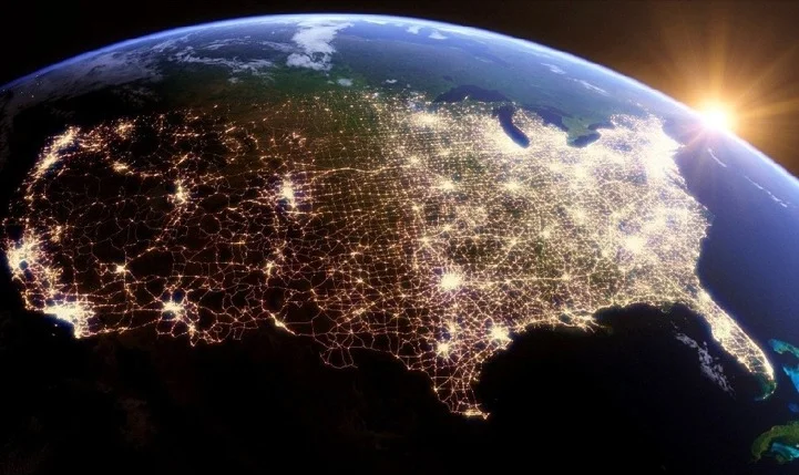
- Visualization of internet distribution;
- The pinpointed distribution of the unemployed;
- Domino’s Pizza’s raw ingredients’ delivery routes in the Northeast;
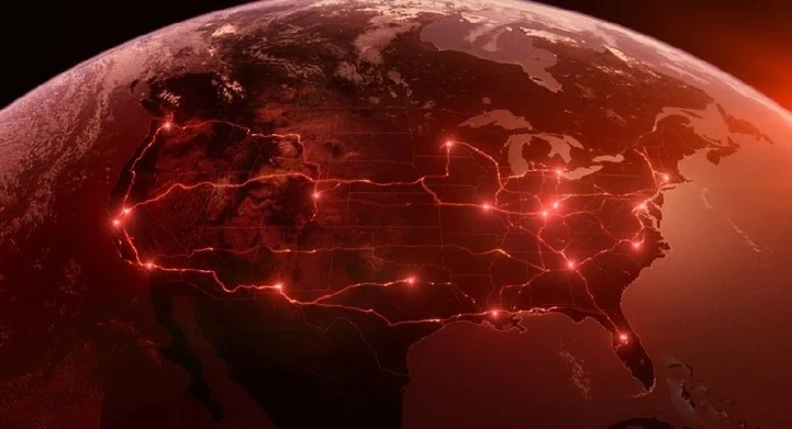
- U.S. electricity network routes;
- Traced paths of deceased bodies being transported to their hometowns;
- U.S. imports and exports of beef;
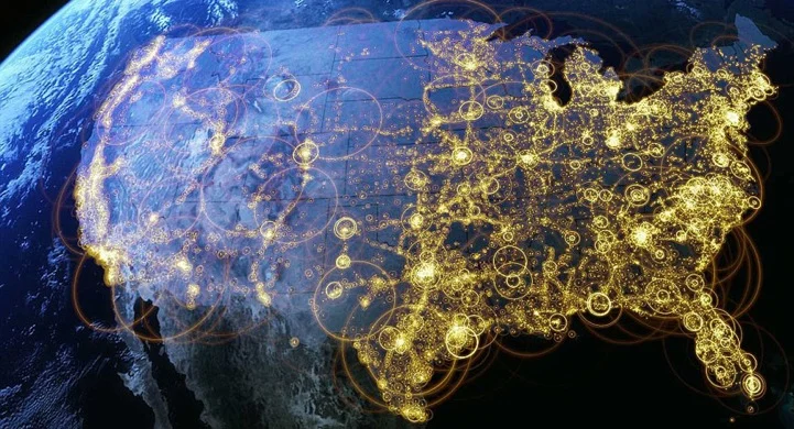
- All the people in America’s towns and cities.
Full episodes of the series can currently be viewed online for U.S. residents only.
/
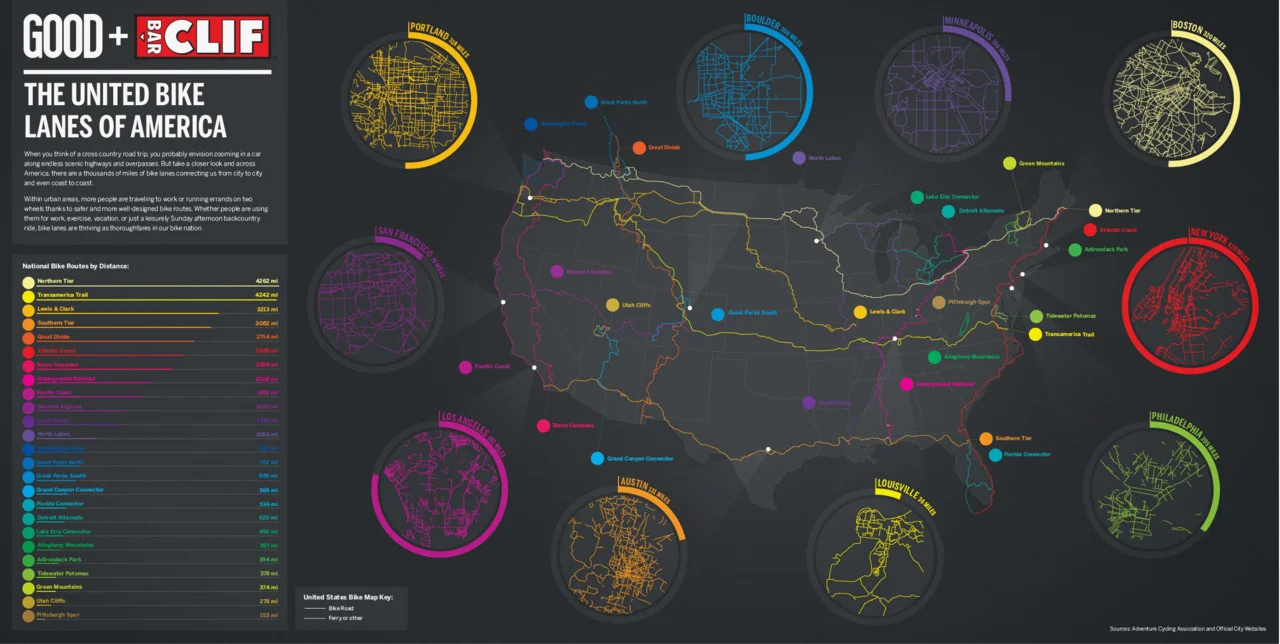
Infographic | Transportation in Cities: ‘The United Bike Lanes of America’
(Source: GOOD Magazine)
/
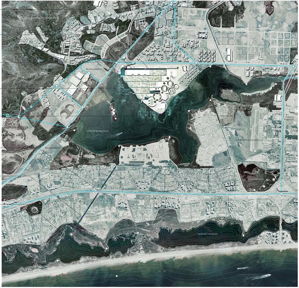
Rio de Janeiro 2016 Olympic park master plan
/
Interactive Islands of Mankind
Geography graduate student Derek Watkins has some fun with population densities in an interactive version of William Bunge’s The Continents and Islands of Mankind. The above shows areas in the world where there are at least 15 people per square kilometer. In the interactive, a slider lets you shift that number up to 500 where only a few spots in the world remain.
/
npr:
Live Wind Map Shows Flow Patterns
I get kind of giddy whenever I see a tweet from Martin Wattenberg and Fernanda Viegas. They rarely tweet, but when they do it’s usually because they’ve released a new project and they always announce it simultaneously. Their latest piece shows live wind patterns, based on data from the National Digital Forecast Database. It’s beautiful to look at.
Incredible.
/
water color map
/
For a hodgepodge of transit map reviews and imaginative new designs, check out Cameron Booth’s web site. I think that my favorite component of the site is — by far — his mapping of the U.S. Interstate highway system in the style of a subway map (shown above). Though it’s a schematic design that would be difficult to use while driving, it certainly makes it easier to remember which Interstate you would need to take in order to get from City A to City B. A friend of mine has the whole system memorized and can tell you exactly which routes you could take to get between any two cities in the U.S. I’ve wanted to be able to do this for a long time, and Mr. Booth’s map may make it quite a bit easier.
Mr. Booth also has a tumblr called transitmaps.tumblr.com. Check it out. I think it’s the first tumblr I’ve decided to follow.
/
/
Homemade Map of the Day: After spending some 6,000 hours over the course of two years creating a map of the United States from scratch, 35-year-old cartographer David Imus was awarded “Best in Show” by the Cartography and Geographic Information Society over the likes of National Geographic, the CIA, and the U.S. Census Bureau.
“The Essential Geography of the United States of America” (embiggen) is a 4’ x 3’ labor of love designed and executed by one man working alone out of a farm house in Eugene, Oregon.
“He used a computer (not a pencil and paper), but absolutely nothing was left to computer-assisted happenstance,” says Slate’s Seth Stevenson. “Imus spent eons tweaking label positions. Slaving over font types, kerning, letter thicknesses. Scrutinizing levels of blackness. It’s the kind of personal cartographic touch you might only find these days on the hand-illustrated ski-trail maps available at posh mountain resorts.”
Learn more about what makes Imus’s map so special here. Also, you can purchase your very own print of “The Essential Geography of the United States of America” on his personal site for only $12.95.
[slate / visualnews.]
Now that’s some dedicated map-loving!

![landofmaps:
Geologic Map of North America [1024x1765]](https://images.squarespace-cdn.com/content/v1/54e6c8ece4b0663b4a76f755/1437625590345-HYCFEHEG9QVY2CX0JFQG/image-asset.jpeg)


