http://www.dailymail.co.uk/news/article-1315078/Race-maps-America.html
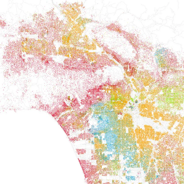
Racial Map of Los Angeles. Each dot equals up to 25 people.
Red: White
Blue: Black
Green: Asian
Orange: Hispanic
Gray: “Other”This is from the year 2000. 10 years later this has definitely changed, I wonder what the updated version would look like.
